FODMAP Tracking Apps vs. Offline Symptom Dashboard: Which Is Better?
Monash FODMAP app vs. Fig vs. offline symptom dashboard for IBS: honest comparison of the 6-week reintroduction phase tools, doctor prep features, and
Published June 3, 2026
Our verdict
For IBS patients doing the 6-week FODMAP reintroduction phase, the IBS FODMAP Reintroduction Dashboard at $22 one-time tracks food, symptoms, and bowel events across 42 days and generates a 2-page doctor-ready summary from your actual correlation data — the only tool built specifically for reintroduction, not just avoidance.
The FODMAP diet has two distinct phases, and most tracking apps are built for only one of them. Here is how the major options stack up for patients in the critical reintroduction phase.
The Elimination Phase vs. Reintroduction Phase Problem
The Monash FODMAP app and most FODMAP tools are designed for the elimination phase: checking whether a food is safe to eat. That is genuinely useful. Monash’s food database is the most scientifically accurate available.
The reintroduction phase is a different problem. Over 6 weeks, you reintroduce one FODMAP group at a time — fructose, lactose, fructans, GOS, polyols — testing your tolerance to each at specific serving sizes and waiting 3 days between challenges to let symptoms clear. You need to log symptoms by severity, bowel characteristics, timing, and correlation to specific foods. Most patients are doing this in a paper journal or a generic notes app, with no structure and no way to present findings to a doctor.
Monash FODMAP App: Best for Elimination, Weak for Reintroduction
The Monash app is the gold standard for FODMAP food data. If you need to know whether canned chickpeas in a half-cup serving are safe during elimination, Monash has the data. The app also has a basic symptom diary.
What it lacks: a structured 42-day reintroduction calendar, FODMAP group correlation analysis across your logged data, and anything close to a doctor prep summary. You are on your own for organizing the reintroduction results.
Cost: approximately $12.99 one-time (varies by region), with some premium features available separately.
Fig: Practical for Grocery Shopping, Not Symptom Tracking
Fig is built around barcode scanning for packaged foods. You scan a product and see whether it is low-FODMAP safe. This is practical for everyday shopping. For tracking reintroduction symptoms over 6 weeks, Fig offers no specific tools.
Cara Care: Closest Competitor for Gut Health Tracking
Cara Care is a gut health app that handles IBS, IBD, and general digestive symptoms. It offers food and symptom logging, analytics, and a premium coaching tier. It is the most complete gut health tracking app available.
The cost: $5.99-$14.99/month depending on plan. The subscription model is ongoing. Data lives on Cara Care’s servers.
The FODMAP Reintroduction Dashboard: Built for the Six Weeks That Matter
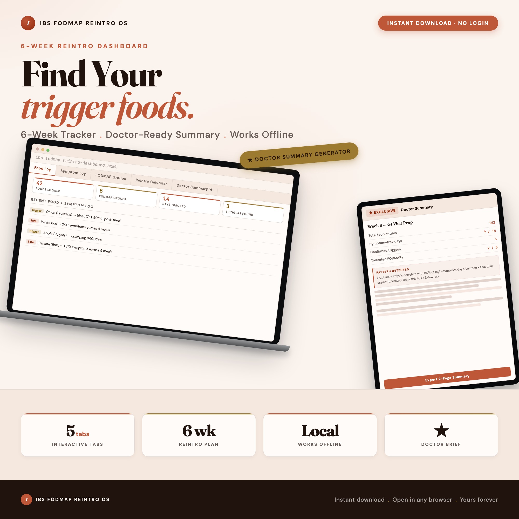
The IBS FODMAP Reintroduction Dashboard is built specifically for the reintroduction phase, tracking symptoms and correlations across 42 days in one browser file.
Food Log (Tab 1): Log each food with FODMAP group, serving size, meal time, and notes. The structured format that freeform notes cannot provide.
Symptom and Bowel Log (Tab 2): Daily entries for bloating, pain, urgency, and stool characteristics on a calibrated severity scale. The data your GI doctor actually needs.
FODMAP Groups (Tab 3): Your personal tolerance profile building across the reintroduction period — which groups you have tested, at what serving sizes, with what outcomes.
Reintroduction Calendar (Tab 4): A 42-day structured calendar with 3-day spacing between challenges built in. Tracks which FODMAP group is active for each challenge week.
Doctor Prep Summary Generator (exclusive): Tab 5 reads all your logged data — food entries, symptom scores, bowel logs, FODMAP group responses — computes correlations across the full reintroduction period, and generates a formatted 2-page summary you can hand to your GI doctor or dietitian. No other tool on the market generates this from your actual data. Patients report their follow-up appointments shortened significantly because the doctor could see the pattern immediately.
Why Doctor Appointments Go Poorly Without Structured Data
Most patients with IBS arrive at GI doctor appointments with a verbal summary of the past six weeks: “I think it was worse after eating out, and there was something with onions, and Fridays were bad but I’m not sure why.” Doctors ask targeted questions, patients recall imperfectly, and the appointment produces inconclusive guidance.
The Doctor Prep Summary Generator changes this dynamic. You arrive with a 2-page printed or shared document showing which FODMAP groups correlated with symptom flares, the severity scores over 42 days, and your personal tolerance findings per group. Your GI doctor can see the pattern in 90 seconds instead of reconstructing it through 20 minutes of questions. Patients who have used this feature report that their follow-up appointments moved directly to treatment decisions rather than spending the entire session on history reconstruction.
Which Tool Fits Which Phase
| Monash FODMAP App | Fig | Cara Care | FODMAP Reintroduction Dashboard | |
|---|---|---|---|---|
| Food safety database | Excellent | Barcode-focused | Good | Not a database tool |
| Elimination phase support | Excellent | Good | Good | Not the focus |
| Reintroduction calendar | No | No | Limited | Yes (42-day structured) |
| FODMAP group correlation | No | No | Basic charts | Yes (computed from logged data) |
| Doctor prep summary | No | No | No | Yes (2-page auto-generated) |
| Cost | ~$13 one-time | Free-premium | $6-$15/mo | $22 one-time |
| Data on your device | No (cloud) | No (cloud) | No (cloud) | Yes (localStorage) |
During the reintroduction phase specifically, keep the Monash app for food reference and use the IBS FODMAP Reintroduction Dashboard for the daily tracking and correlation work. Available at ListingResearchOS on Etsy.
Frequently asked questions
- What is the Monash FODMAP app used for?
- The Monash FODMAP app is primarily a food database with FODMAP content per serving size, developed by Monash University. It is excellent for the elimination phase. It has limited tools for the reintroduction phase, where you need to log symptom responses to specific FODMAP groups over multiple days.
- What is the difference between FODMAP elimination and reintroduction?
- The elimination phase removes all high-FODMAP foods to establish a symptom baseline. The 6-week reintroduction phase systematically reintroduces one FODMAP group at a time to identify which specific groups trigger your symptoms. Reintroduction is where most patients need better tracking tools.
- What does Fig do differently from the Monash app?
- Fig focuses on scanning packaged food barcodes to check FODMAP safety, making it more practical for grocery shopping. It is less useful for tracking symptom responses during reintroduction.
- What is the Doctor Prep Summary Generator?
- Tab 5 of the IBS FODMAP Reintroduction Dashboard reads your food log, symptom log, and bowel logs from the full reintroduction period, computes FODMAP group correlations, and generates a formatted 2-page doctor-ready summary. Your GI doctor or dietitian can see which groups correlate with symptoms without you having to explain 42 days of notes verbally.
- Is gut health data sensitive to store in a cloud app?
- Many patients prefer not to share IBS symptoms, bowel habits, and food logs with a cloud service. The FODMAP Reintroduction Dashboard stores everything in your browser's localStorage. Nothing leaves your device.
The winner: interactive dashboards
No spreadsheet. No subscription. One HTML file that runs offline in your browser.
ListingResearchOS Shop
Stop comparing — start using
Interactive dashboards. One-time purchase. No subscriptions. Works offline.
Browse the Etsy Shop →